Storyof

© STORYOF

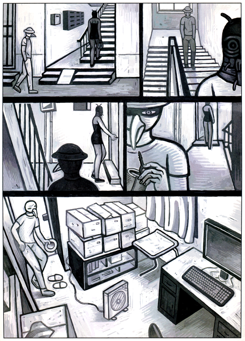
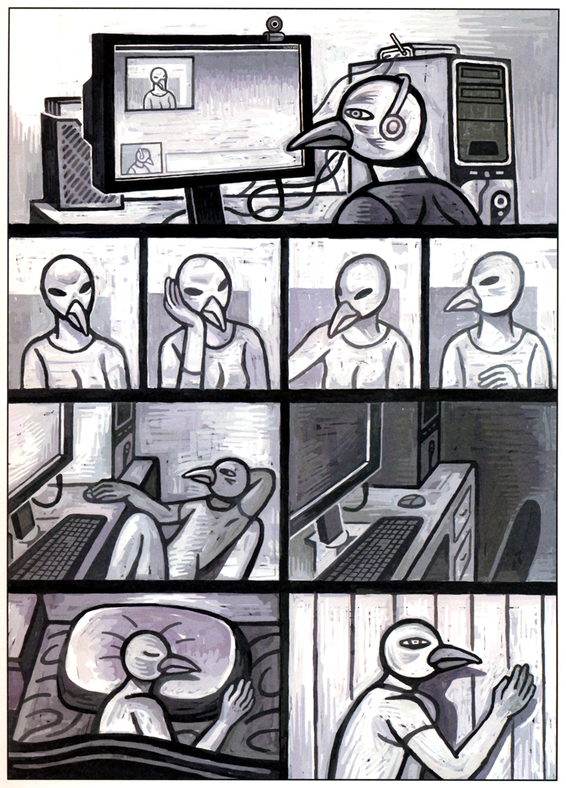
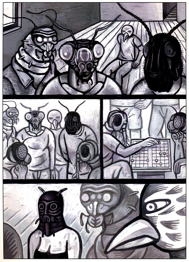
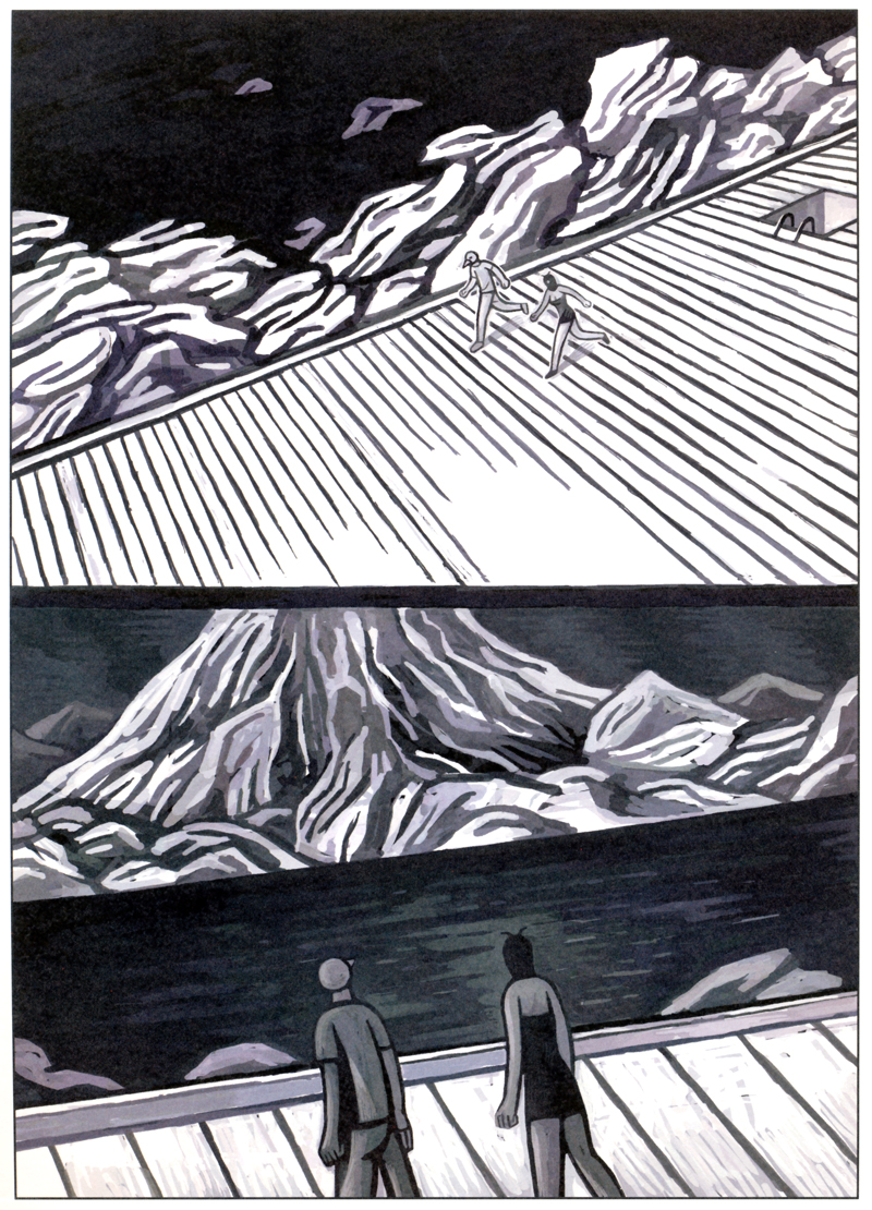
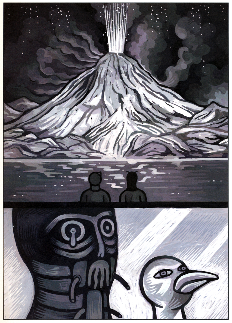
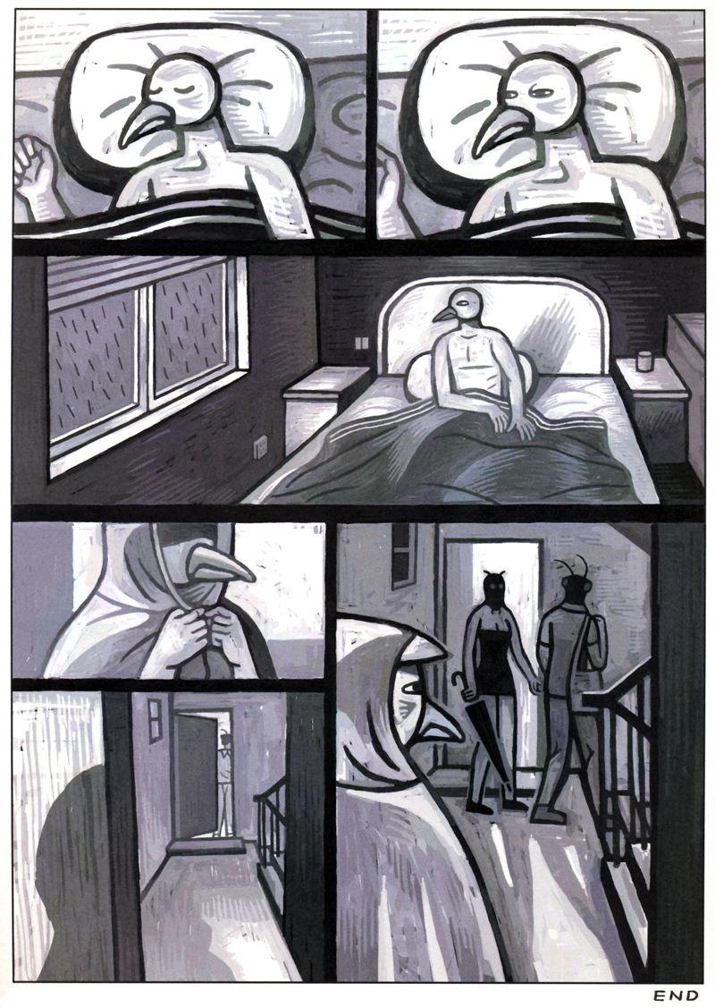
After years of studying architecture, HUXIAO JIANG aka STORYOF has decided to work as an illustrator since 2002. Less than five years later, he published along with ZHANG XUN and DN SPECIAL, Comix; a magazine which features short stories, black and white drawings, very contemporary graphics and deliciously dark subjects by various Chinese illustrators.

Comix 3. has been successfully presented for the first time at the Angoulême International Comics Festival last year and got the award for the “best alternative comics”.

And Good news: Comix 4 is out since January and has been also presented at the Angoulême International Comics Festival last week.

Anyone speak Chinese? OK, his blog is here.

Valerie Collart

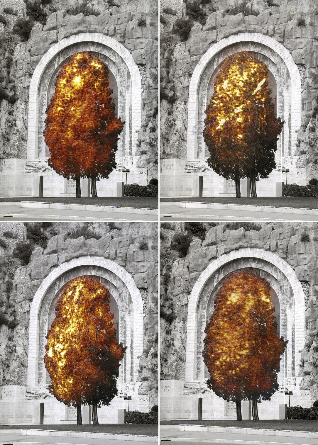
Falsities, Monument. 2010. C-print. 30 x 40 cm

Oxidation, crystallization, pictorial qualities of certain textures, deconstruction and lightening of mass are the vocabulary of  VALERIE COLLART, a French artist who now lives and works in Danemark.

“Falsities”, is a series of photographs, started in 2010, which has been physically manipulated in order to create an other tension in the image regarding the composition as well as, the historical background of what is represented in the photo. The colors, that appear, come from the chemical compounds of the inks, which have been slowly sanded down from the surface of the photo.

One of her key interests is exploring the idea of surfaces giving a false impression to an objects contents, contradicting our impression of its volume. Make sure to view more intriguing projects via her website http://valeriecollart.net/.

Studio Reizundrisiko for WFW

Logo by STUDIO REIZUNDRISIKO for WFW. 2011 © STUDIO REIZUNDRISIKO

The first big thing for February 2011 is the fact that WE FIND WILDNESS has a new logo!

Of course I couldn’t do it myself. But fortunately SAMUEL BÄNZIGER from STUDIO REIZUNDRISIKO, a Swiss graphic design studio, contacted me a few days ago to propose me a new logo.

Through a collection of posters, self-initiated magazines, developed type faces and experimental art direction, STUDIO REIZUNDRISIKO seeks to create radical graphic design and to explore the boundaries of this medium. For sure, a fresh mind! Make sure to check out his projects which include  http://fucking-good-books.ch/, a captivating website that features cute girls and books!

For WFW, he has created a system of logos. Every month the symbol at the left corner of your screen will be a new one but always based on the typography of these three letters: W, F, W. Additionally he also created this short video. Raw, experimental and loud, enjoy!

Big up to SAMUEL!

Note to the people who only read the feed: you’ll have to drop by to see the logo.


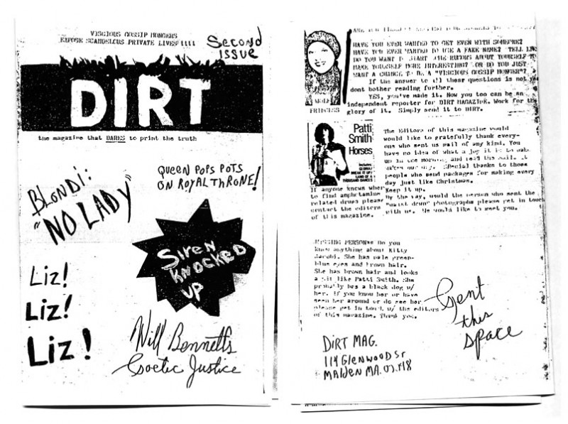
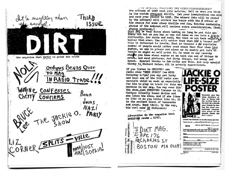
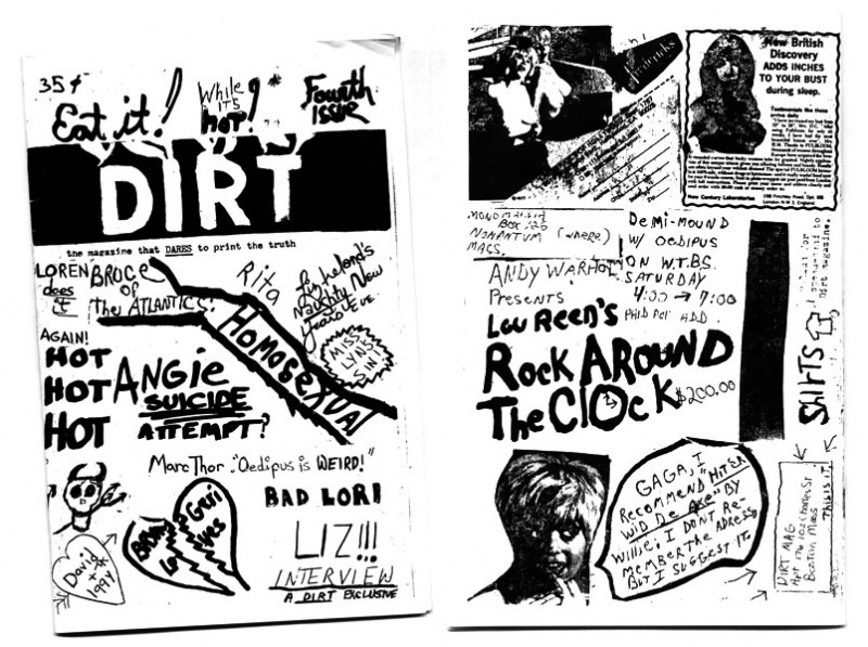
Mark Morrisroe. Dirt Zines


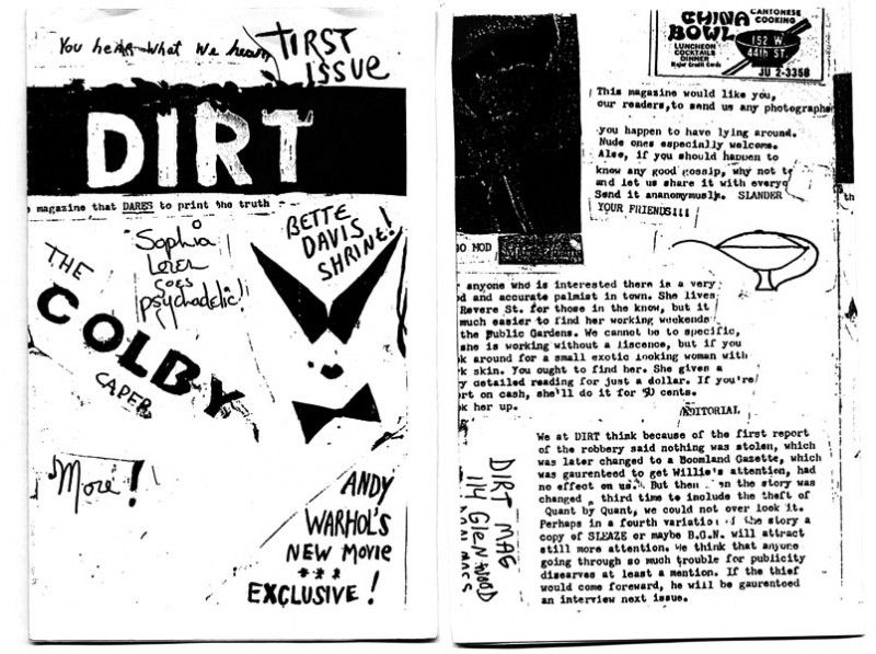
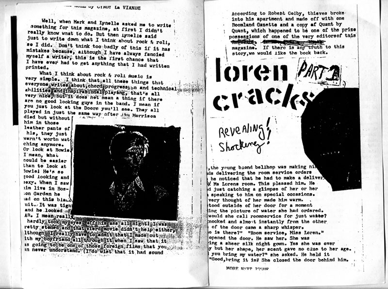
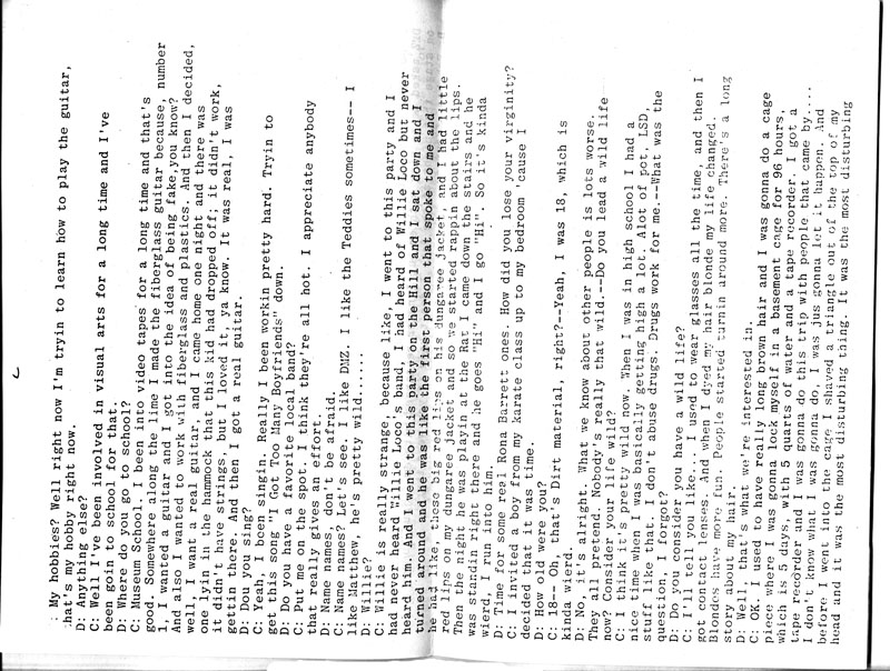
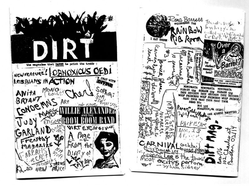
Dirt, the magazine that DARES to print the truth. Complete Reissues 1-5. 2009
originally published 1975, 1976, 1977
by MARK MORRISROE & LYNELLE WHITE. Boston, USA


First Issue, front and back cover

Issue One, inside view

Second Issue, front and back cover

Second Issue, inside view

Third Issue, front and back cover

Third Issue, inside view

Fourth Issue, back and front cover

Fourth Issue, inside view

Fifth Issue, front and back cover

Fifth Issue, inside view

all images scanned by WFW © LYNELLE WHITE

Some things never go out of style. Just like these zines by MARK MORRISROE (1959-1989) that I bought last Saturday at Fotomuseum in Winterthur, Switzerland.

MARK MORRISROE‘s short period of creativity in the 1980s was astonishingly productive and stands out because of its individual aesthetic. He captured his friends in painterly portraits and nude photographs; the Polaroid camera became a mirror of his own body, reflecting its illness and decay. He also understood the possibilities for various media as well as their inherent boundaries, adopting ingenious printing methods for each. During the three years leading up to his death he transferred his photographic experiments more and more to the darkroom, where he used pages from porn magazines and X-ray images of himself as negatives.

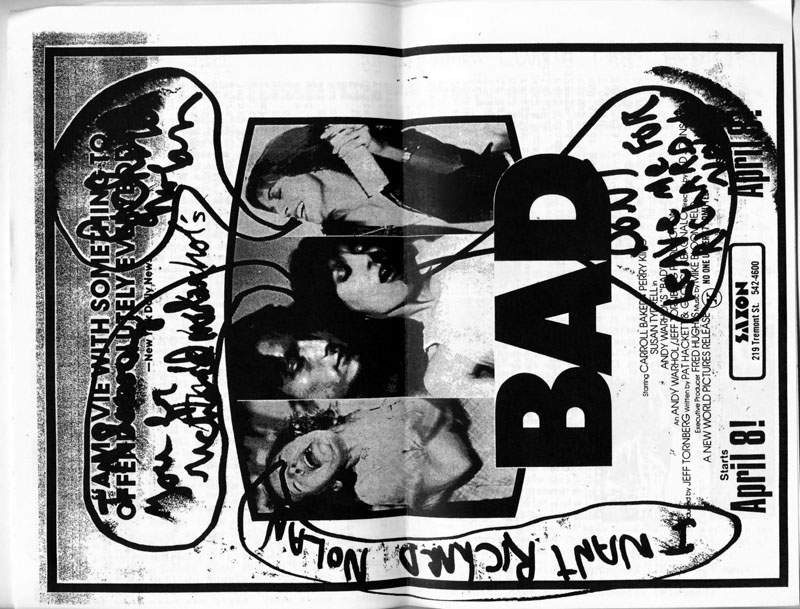
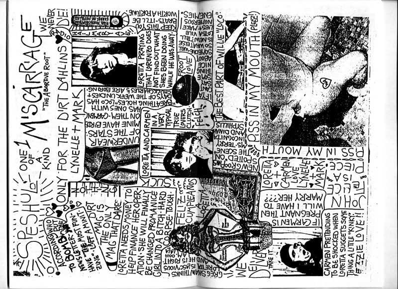
In the Boston scene of the early 1980s, MARK MORRISROE was a charismatic figure widely known under the name “Mark Dirt”. In 1975 and 1976, even before he studied art, he produced five editions of the collaged, and xeroxed magazine Dirt, together with LYNELLE WHITE. Mixing fact with fiction, the editors relayed the juicy details of underground life. A hilarious send-up of celebrity rags!

I really encourage you to visit the exhibtion at Fotomuseum Winterthur which features early color and black-and-white prints, Polaroids, and Polaroid negatives from which it was possible to make enlargements, as well as the early and late photograms he processed by hand.

For those of you who can’t make it either because you are too far away or you didn’t get a slot, the first comprehensive monograph, realized on occasion of an exhibition at the Fotomuseum Winterthur and in collaboration with The Estate of Mark Morrisroe, is now available in the WFW Store.

Dashenka Prochazka

at RA 13, Antwerp. 2009

at RA 13, Antwerp. 2009


at La Galerie BastilleTV, Paris. 2009

at Fumetto Festival Luzern. 2009

at Fumetto Festival Luzern. 2009

at Fumetto Festival Luzern. 2009

at Fumetto Festival Luzern. 2009

at La Galerie BastilleTV, Paris. 2009

I can’t remember exactly how and when I discovered the work of DASHENKA PROCHAZKA, an extremely active artist who paints, draws, sculpts, silk-screens, creates installations and musical performances. And to be really honest, I don’t know exactly what her work is about.

However, what I saw on her website intrigues me so much that I want to see more. And in person. Stay tuned!

Jürg Lehni. Viktor

Viktor – 5000 Years of Chairs. 2008. Dc motors, tool head, sprung steel coils, cables, scriptographer software. Developed in collaboration with BRUNO THURNHERR and MARCELL ACKERKNECHT, Defekt gmbh © JÜRG LEHNI

Viktor, a large wall-drawing machine that is controlled by an adapted design software and powered by four small industrial motors, traces imagery in chalk on the black gallery wall: a project between art, design, and engineering by Swiss independent designer, developper and artist JÜRG LEHNI.

Over the past years he worked on a family of projects that are all linked through his reflections about tools, the computer and the way we work with and adapt to technology. Most of these projects were collaborations with people from other backgrounds (graphic designers, artists, typgoraphers and engineers) like Hektor. Hektor is similar to Viktor but uses two motors instead of four and employs spray paint rather than chalk and it has been invented in collaboration with the engineer ULI FRANKE. This machine made its debut as JÜRG LEHNI’s art-school graduation project at the Ecole Cantonale d’Art de Lausanne (ECAL) in 2002 and has performed regularly ever since.

Far from being a closed mechanical device — a black box between creative impulse and output — the concern of Hektor (and now Viktor) is the nuanced interaction between the user and the technologies of communication. The drawing machine Viktor is an amalgam of digital and mechanical technologies. A collage of tools, all of which were invented for other general and specific uses.

I wanted to make new things with new meanings using what I knew already,” he says. “I wanted to bring back the spirit of printing or publishing or design from the past, but using modern technology. My computers became my working tools, my brushes and paint.” – by JÜRG LEHNI

Frederic Post

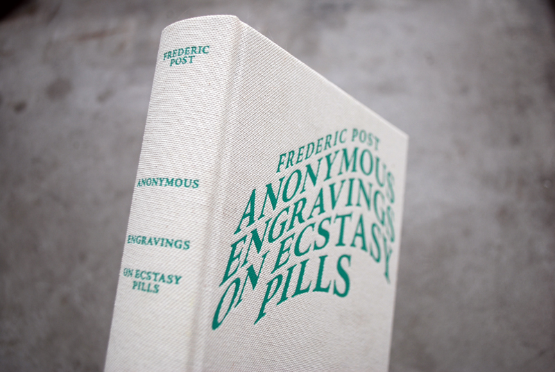
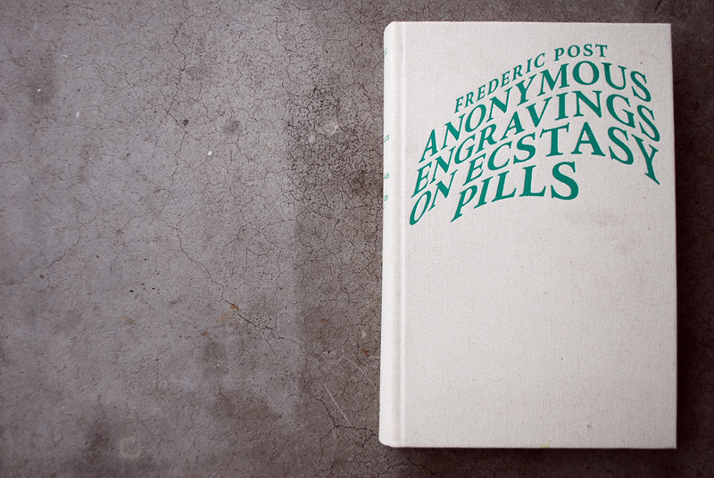
Anonymous Engravings on Ecstasy Pills by FREDERIC POST
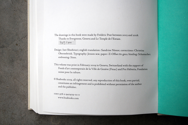
Design: IZET SHESHIVARI. Hardcover, 544 pp., offset 1/1, 154 x 232 mm
Edition of 500. ISBN 978-2-940409-02-0
Published by Boabooks

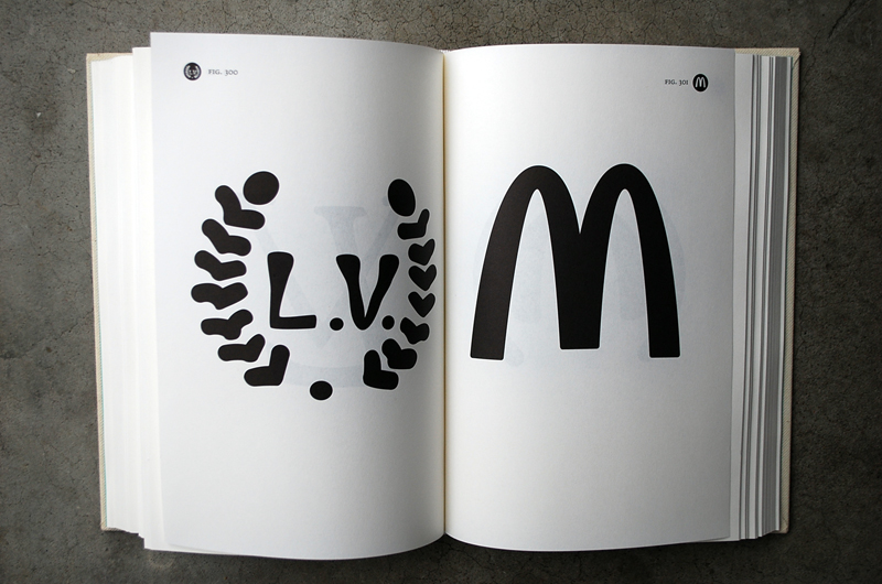
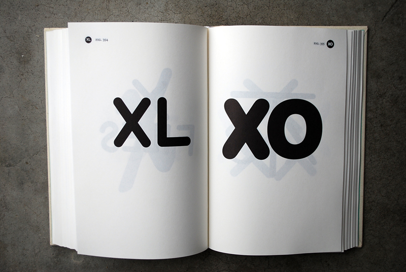
Like a modern-times archaeologist, Geneva-based artist FREDERIC POST hunted, collected and copied logos of Ecstasy pills during five years. Only interested in the visual dimension of these objects, he compiles his collection of drawings in a book entitled “Anonymous Engravings on Ecstasy Pills”, conferring thus value to an underground iconography of over 500 signs.

The classification of the drawings is divided into three groups (figure; referring to people or objects/ typography: letters and words/ symbols: abstract elements, geometrical forms) and was carried out with artist and designer IZET SHESHIVARI.

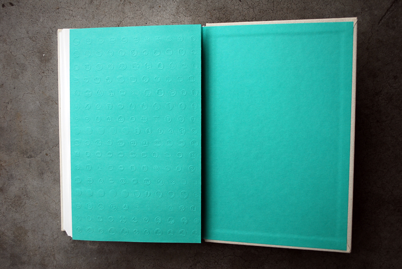
I am fascinated by this book, by the role of collector of the artist,”I have the feeling that objects acquire a more universal meaning once collected” and how his appropriation of these objects, gave them another meaning. I don’t forget to mention the entire design – the linen cover, the paper, the typography and the green sheet at the end – that I love!

Nowadays, with drug use, we want to experiment this unconstrained pleasure, disrupt the humdrum routine, make love longer; we want to party even though we are tired (…). At the end of the day, this is in line with the whole idea of work, profitability and performance”.

Around this concept, FREDERIC POST also developped an “Ecstasy Nacht” and necklaces made with moulds of ecstasy pills called “Ecstasy jewelry“. And good news: you can buy this book via http://www.boabooks.com

.

Gabriella Hohendahl


Untitled © GABRIELLA HOHENDAHL

Three things you need to know about GABRIELLA HOHENDAHL:

  1. She is a Swiss photographer
  2. graduated from the Zurich University of the Arts (ZHdK) in 2007
  3. where she developped her very personal, poetic and sometimes a bit disturbing means of expression

.

Lara Gasparotto

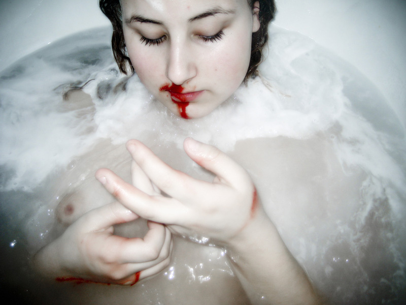
the bloodsister

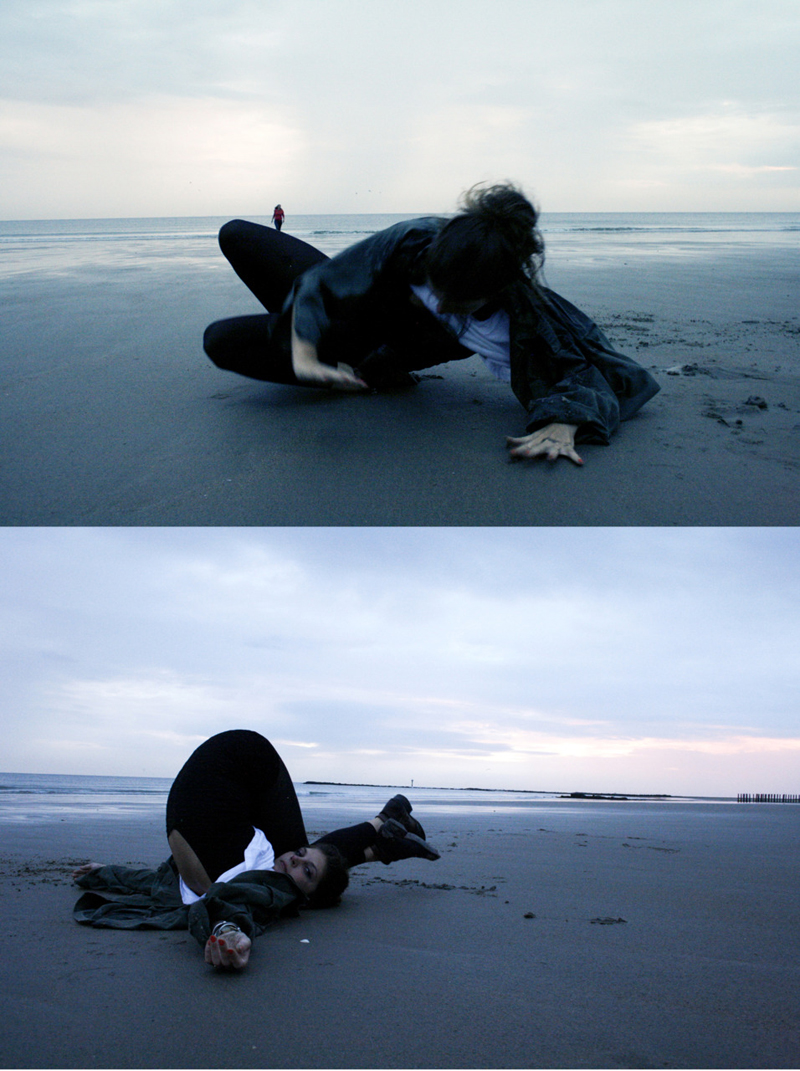
North Sea at dawn

Remy the exhibitionist


all images © LARA GASPAROTTO

My eye has been attracted by a tiny image in an exhibition catalogue. The name was even smaller: LARA GASPAROTTO.

LARA is a young girl from Belgium who takes pictures and shares them via her tumblr. Nothing special apart the fact that she is highly talented. No doubt why she has been chosen to present her work at the exhibition  “Borders/NoBorders : Historical and contemporary photography of Belgium” at the Kommunale Galerie Berlin last year.

Keep an eye on this girl!

Paul Sharits

WORD MOVIE / FLUX FILM 29 by PAUL SHARITS. 1966. 16 mm. 4′ 00

Member of Fluxus, PAUL JEFFREY SHARITS (1943-1993) was an American multimedia artist, best known for his experimental or avant-garde filmmaking. His film work primarily focused on installations using infinite film loops, multiple projectors, and experimental soundtracks.
Trained initially as a painter, and a prolific theoretical writer, he was really an artist working within the medium of film, not in storytelling, but in directly visual ways. His main contribution was in the abstract direction; he was very much interested in color and light and explored more than anyone else how the individual frame worked on the viewer, how color affect us and which moods they create.

More than any of PAUL  SHARITS flicker films, Word Movie most closely literalizes the flicker effect of the [film] shutter mechanism through its use of the separate word for each frame coupled with the single frame units of color. The word structure as a single unit becomes an analog for the individual film frame. And at the same time as serving that function, the word emphasizes the screen frame perimeters as certain words are horizontally cut off by the film line.by REGINA CORNWELL

His work is distributed by The Film-Makers’ Cooperative and Canyon Cinema. And an excellent book about PAUL SHARITS (edited by YANN BEAUVAIS) is now available in the WFW Store

Terry Haggerty

Out of position. acrylic on canvas. 143 x 12cm. 2010

Emulator. acrylic on canvas. 76 x 63cm. 2010

Angle of response. acrylic on canvas. 174 x 150 cm. 2010

recycle. acrylic on canvas. 61 x 74cm. 2010

Into Position. acrylic on canvas. 142 x 120cm. 2010

TERRY HAGGERTY plays with our perception: the eye involuntarily attemps to put the lines together, to close gasps and to identify a known structure. The two-dimensional paintings suddenly resemble painted volumes or reflect the illusory perception of a third dimension.

British-born artist TERRY HAGGERTY who lives in Berlin and New York creates his geometric abstractions on computer and transmits his design on a primed canvas, on blocks of wood or on walls. Subsequently, the shapes are colored in or sprayed and covered with several layers of varnish. Unusual is also the fact that nowhere is the work of the artist hand visible: brush strokes and all gestural spontaneity have disappeared, almost as if it is machine-made.

HAGGERTY‘s abstract line compositions seem to combine the tradition of Minimalist painting and Op Art, a movement developed in the late 1950s and early 1960s that involved the use of perceptual phenomena as a creative tool. His minimalist paintings are exceptionally contemporary even though their central theme is about playing with illusion.

Subtle and perfect!

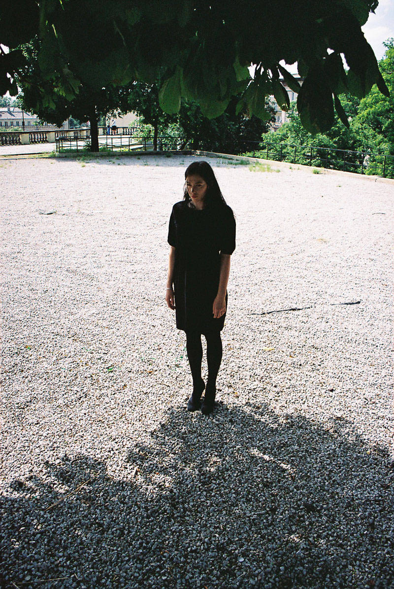
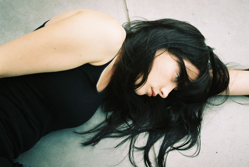
Lukasz Wierzbowski for WFW

all images © LUKASZ WIERZBOWSKI

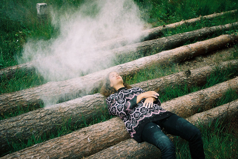
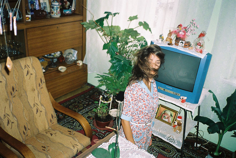
When LUKASZ WIERBOWSKI proposed me to feature a little selection of unpublished photos just for WFW, I was really thrilled. Three months later, eight days ago earlier, I received a rich portfolio: a truly great gift from this young photographer, now impossible to missed.

If you are not familiar with LUKASZ WIERBOWSKI, he is self-taught photographer from Wroclaw, a city on south-west side of Poland where he became dental technician then he started studying psychology, only to realize that the only thing he truly loves is photography: “my father introduced me to photography when I was still a kid. Afterward, I had like ten years break, and was doing different stuff. I came back to photography probably three years ago. I remember in high school, I was very much into making short movies with VHS camera. After few years I got bored with it and switched to photography.

Shooting with a Canon Elan II, Canon Rebel K2 and Olympus Mju II, his images, mixing girls and plants, were such a hit that he had his work published by Pogo Books last year.

Make sure to check out his website (where his printed pieces are now available to buy for a pretty affordable price) and his flickr

source

Gelitin

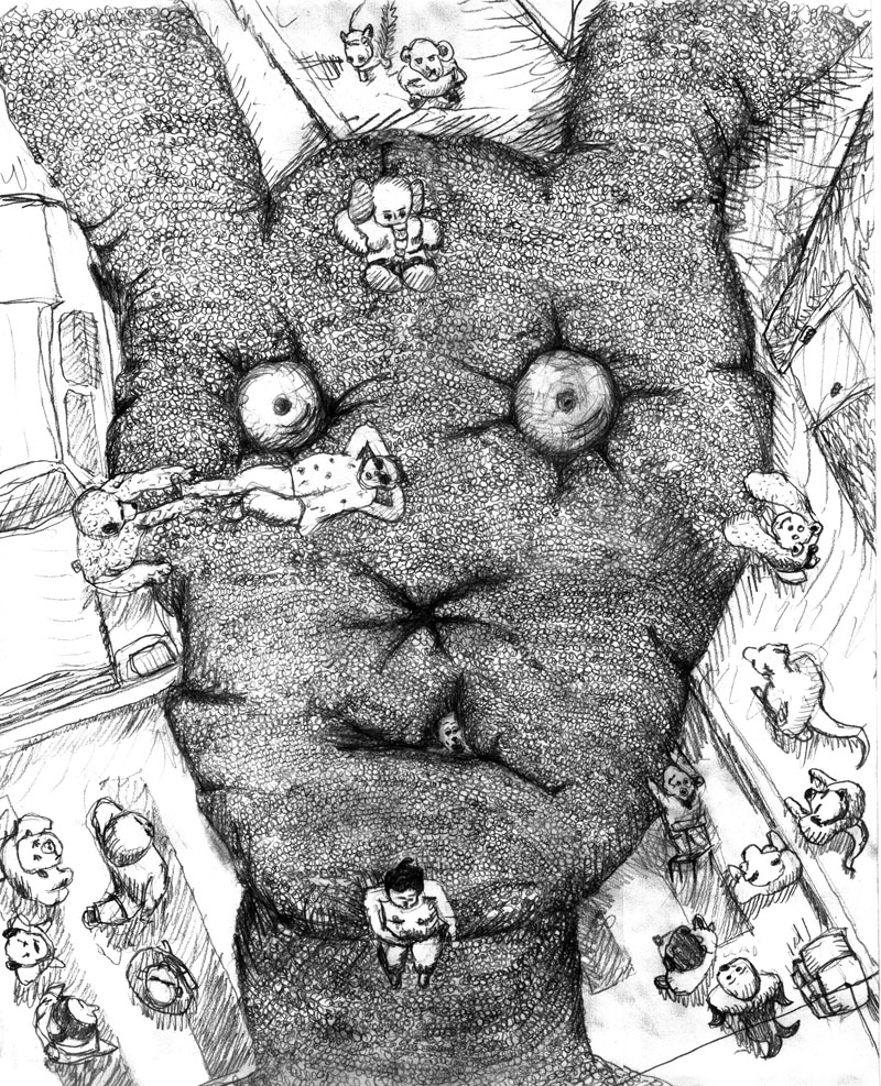
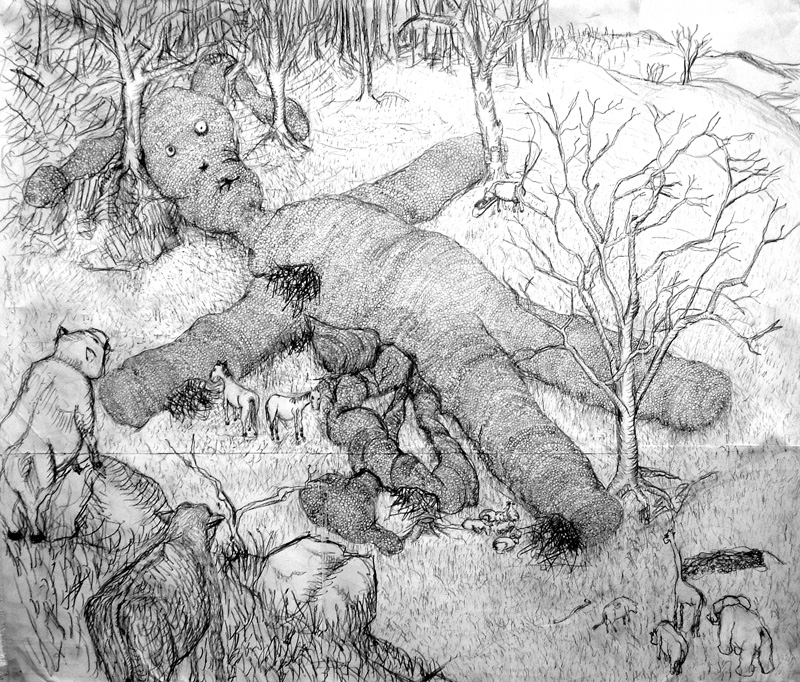
Rabbit drawing © GELITIN

Rabbit drawing © GELITIN

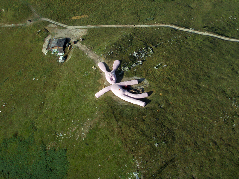
Rabbit seen from the sky © GELITIN

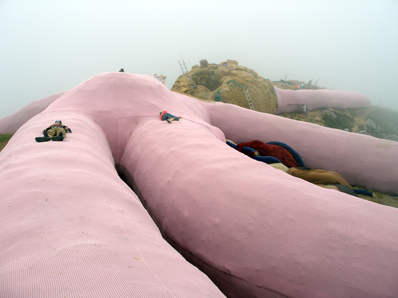
Rabbit during construction © GELITIN

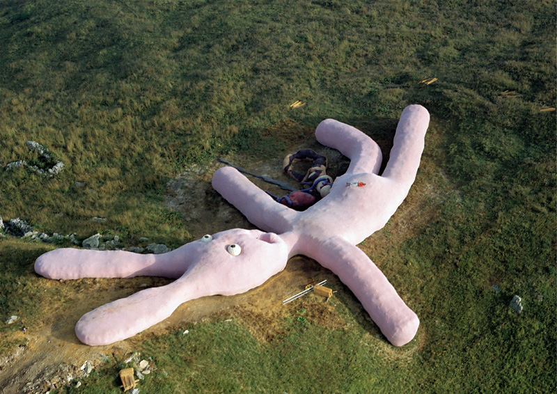
Rabbit © GELITIN. 2005-2025

Yesterday afternoon while I was cleaning my library, I stumbled upon this “not brand new but crazy” project by GELITIN (ALI JANKA, WOLFGANG GANTNER, FLORIAN REITHER, and TOBIAS URBAN).

As Austria’s premier artist’s collective, they have, since they started working together in the mid-90s, literally turned the art world into a giant playground. DIY constructions evincing varying degrees of rationality, their works leave plenty of room for improvisation and for the participation and above all, moods of spectators. Practicing their own unique brand of performance-based happening inspired interventions, the rethink the parameters of art: “It doesn’t matter whether you think our work is good or bad. The question is does it have an effect on you? Does it confront you with something new? Does it make you think“.

While their work can be found in galleries and museums, GELITIN‘s most remarkable productions remain their installations and performances. Like this giant pink bunny – 60 meters long and 6 meters high- knitted by grandmothers over the course of five year and placed near the village of Cuneo in Italy in 2005. Because of its size, this installation reverses human perspective and enters into a dialogue with a distorted perception of space that reminds us of childhood.

Let the parents, i.e. artist collective GELITIN speak:

The things one finds wandering in a landscape: familiar things and utterly unknown, like a flower one has never seen before, or, as Columbus discovered, an inexplicable continent; and then, behind a hill, as if knitted by giant grandmothers, lies this vast rabbit, to make you feel as small as a daisy. The toilet-paper-pink creature lies on its back: a rabbit-mountain like Gulliver in Lilliput. Happy you feel as you climb up along its ears, almost falling into its cavernous mouth, to the belly-summit and look out over the pink woolen landscape of the rabbit a­s body, a country dropped from the sky; ears and limbs sneaking into the distance; from its side flowing heart, liver and intestines. Happily in love you step down the decaying corpse, through the wound, now small like a maggot, over woolen kidney and bowel. Happy you leave like the larva that gets its wings from an innocent carcass at the roadside. Such is the happiness which made this rabbit. I love the rabbit the rabbit loves me…

It waits there to be visited by you. You might even take your time or check back every now and then as the rabbit will wait for you until 2025. For more details how to get there, please check the artists’ website: http://www.gelitin.net

On my to do list for sure!

Dorothée Baumann

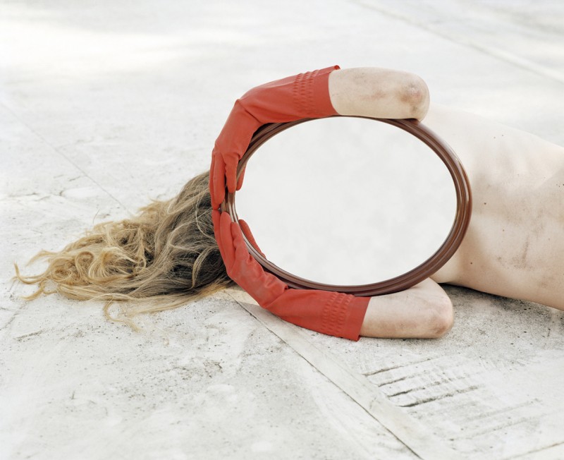
Face You. 75 × 92 cm. lambda print.  2004 © DOROTHÉE BAUMANN

First impressions: a broken doll, a gaping void in its back, tossed into the street… Then: a mirror, a face-like blank slate, reflecting nothing… Slowly we worked it out: a real body, a girl or a woman, holding a mirror to her face for protection. But protection from what? From us? From our gaze? We cling to the old adage that the face mirrors the soul. Give us your face, we demand. Bare your soul! She resists. Giving up the mirror would mean abandonning her dream. – Text of  WILLIAM A. EWING, Face. The New Photographic Portrait, Lausanne, Musée de l’Élysée

Swiss photographer, video artist and teacher DOROTHÉE BAUMANN proves that it takes so much more than just taking a pretty picture to call yourself a photographer. This pleasantly haunting photo is just a few from her fictional-documentary portfolio.

Loris Gréaud

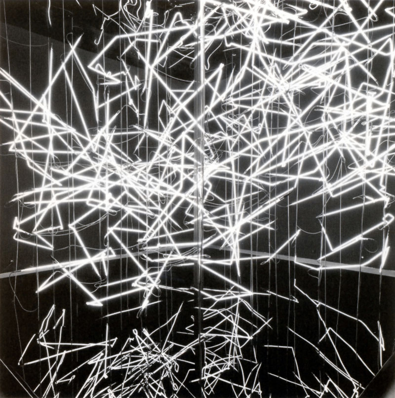
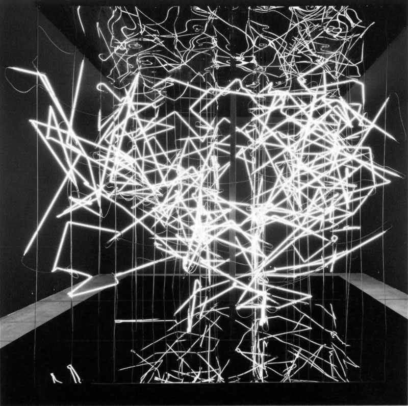
Neon Bubble. 2008
Neons, metalic, structure and black plexiglas/ 400 x 400 x 400 cm
Developed by DGZ research

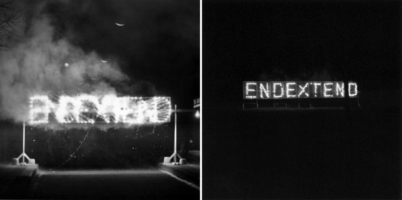
End Extend. 2006
Pyrotechnic animation
Variable dimensions

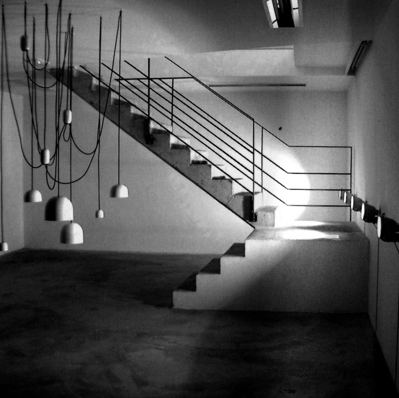
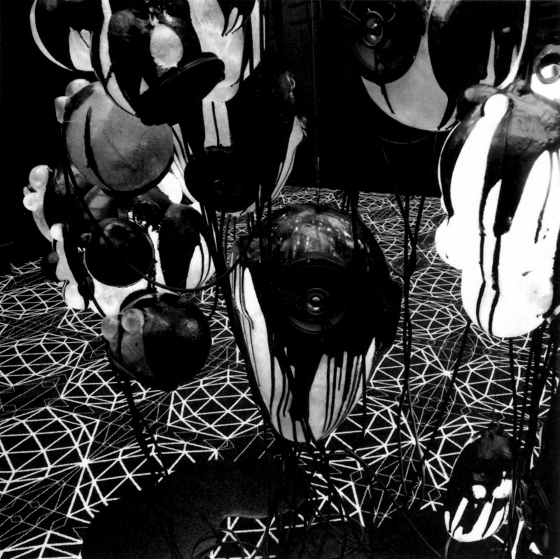
Spore Speakers. 2003
Sound installation. Variables dimensions
Designed by JAMES HELEY, Sound design by GERY MONTET

Crossfading Suitcase. 2004
Mixed media
160 x 550 x 150 cm

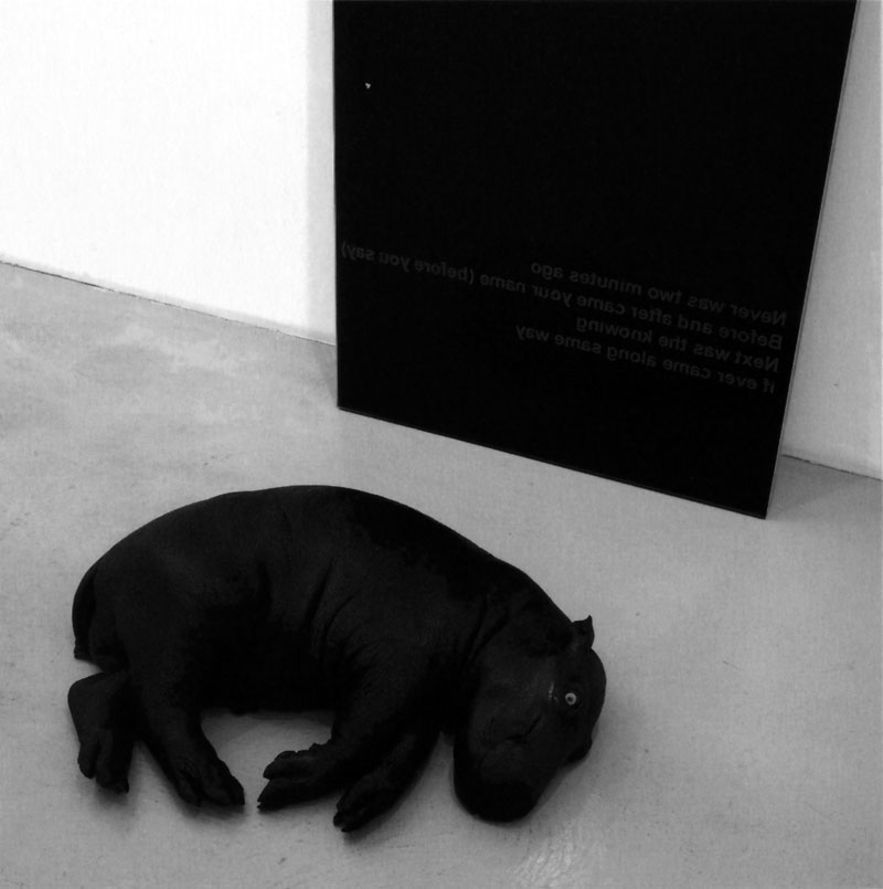
Never Was Two Minutes Ago. 2007
Black Mirror, mould hippopotamus
190 x 80 cm

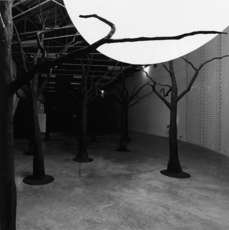
Gunpowder Forest Bubble. 2008
44 trees sculptures covered  with resin & gunpowder
Developed by VINCENT NÉVOT for GreaudStudio

Spore Speakers. 2008
Resin, sound speakers, modified light bulbs
Developed by VINCENT NÉVOT for GreaudStudio

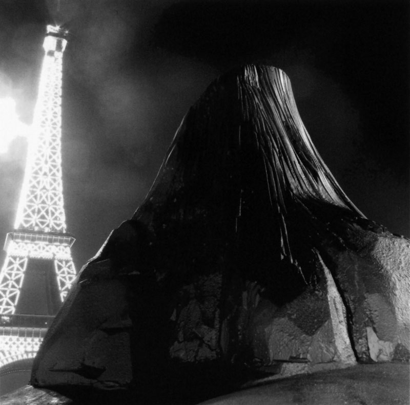
Devils Tower. 2006
Resine, paint, modified aluminium truck sculpture. 355 x 200 x 220cm
Developed by VINCENT NÉVOT for Gréaudstudio

part of Revolutionary Is A Revolutionary Weapons 2007

LORIS GRÉAUD is a French artist who has been considered as one of the most innovative and distinctive artists to emerge on the international art scene in recent years.

Fluctuating between the fields of film, sound and installation, GRÉAUD was trained in a variety of disciplines while attending the famous Conservertoire de Musique in Paris from which he got expelled after setting up a recording studio: “A studio to stop music” as the artist once stated. It was here where the artist also launched his own music label, Sibilance Production for the production and distribution of electronic music. Prior to his studies at the conservator, GRÉAUD‘s studies included filmmaking and some semesters of graphic design before he finally arrived at the Ecole des Beaux-arts de Paris Cergy. In 2004 he established the research studio DGZ (Dölger, Greaud, Ziakovic), in partnership with a designer and an architect, with the declared mission to ”cancel borders between disciplines“.

His work isn’t limited to one place or time, nor to the conventions of a typical museum exhibition. It boomerangs across disciplines, locations, time periods, even between reality and the immaterial. “I like creating beautiful stories that connect to make something vast, going beyond the public’s understanding or even mine,” he said. He refers to his process as an “empirical machine,” a production chain involving architects, musicians, engineers and historians and spanning fields as diverse as quantum mechanics and neurology. Comparing himself to an orchestra conductor, he guides each project while letting it take on a life of its own. It is not about passing on the command to someone else but it is indeed about creating a space for dialogue.

What could, at a first glance, be perceived as a scientific experience, is more appropriately related to philosophical and ethical issues. Three branches of research seem to coexist in the work of LORIS GRÉAUD: technology, perception, and belief. For the artist, to believe is often more interesting and more important than to see. The medium thus follows logically the idea, the shape follows the concept. – by FLORENCE DERIEUX